After this sample, we are comfortable in case we had to use it on any Dashboard so was a great initiative from Pentaho as they improve look and feel
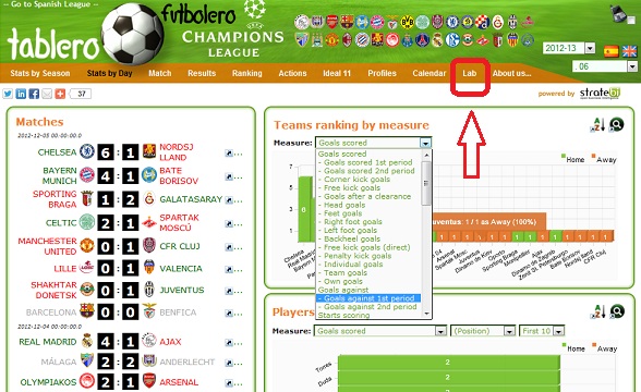
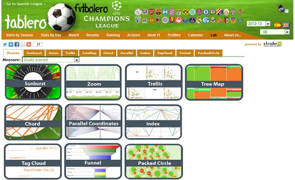
You can access under the 'Lab' section:

Hope you like and find it useful. If you have any suggestion about new advance visualization charts, don´t hesitate to write us with your ideas in order to include it

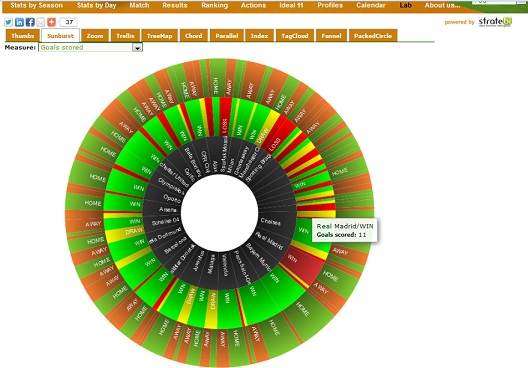
Sunburst in action


